
Broadway Poster Art - The Top-Ten Most Successful Designs

I have always been particularly intrigued by the poster art of Broadway musicals and how a simple image can tell so much while simultaneously enticing the throngs to enter into the theatre and buy a ticket. In my college theatre management class we examined poster art and how the slightest misstep can be fatal. The original poster for Damn Yankees was simply the title of the show with some pennants and other baseball imagery around it. Ticket sales, despite good reviews, were sluggish. The solution: slap a scantily clad picture of star Gwen Verdon over the title and WAMMO! - a home run. Tickets sales went through the roof.
A few years ago, I had the wonderful opportunity to chat with poster designer David Byrd who, among many other achievements in rock poster design, created some of the most iconic theatre posters including those for the original Godspell, Hair, Jesus Christ, Superstar, Little Shop of Horrors and Follies. Mr. Byrd shared the essentials of great poster: they need to first catch the eye, second establish mood, and third impart a quick message.
Lately, I feel as though many Broadway productions have missed the mark with their poster art. In fact, the logos for most recent shows are either dull, uninviting, or overly busy. I reflect back to the 70s and 80s when the form was at its best: one central, colorful image that was forever married to the show it was promoting.
With Mr. Byrd's checklist in mind, I decided to pick what I believe are the ten best Broadway musical poster designs at doing their job: catching our eye, establishing mood, and imparting that quick message.


10. Me and My Girl
Bill Snibson, cockney street sweeper turned English Lord Hareford, leaning against a streetlamp, is the perfect central image for the musical comedy Me and My Girl. Dolled up in an ermine robe, coronet cocked jauntily sideways on his head, the image tells you in one glance that the piece is going to be a fun and sly while imparting that this will be a poor-becomes-rich story.
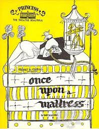
9. Once Upon a Mattress (original 1959 production)
Cartoonish and just plain fun, the poster art for Once Upon a Mattress captures the fairy tale magic of this lunatic adaptation of The Princess and the Pea. Princess Winnifred, perched atop a pile of zanily patterned bed mattresses, sits wide awake as the relentlessly unpleasant Queen Aggravain lurks beneath. Cleverly, the production information is sandwiched in the mattress layers, reminding us of the wacky story ahead.
8. Wicked
Love it or leave it, Wicked is a hit. It's simple and striking poster art is certainly a factor in that success. Featuring two witches, one blonde and beautiful, the other green and slightly imposing, sharing a secret, this design was a clever, economical way to convey this complex story of a deep friendship challenged by differing circumstances and philosophies.
7. She Loves Me (1993 revival)
I've always disliked the poster art for the original Broadway production of She Loves Me. I never felt it captured the mood or spirit of the show, portraying it as a cartoon love story instead of a delicate valentine. The 1993 Roundabout Theatre revival still employed a cartoon, but with a much more elegant result. The blissful Georg Nowack is found mid air, tossing a handful of letters into the air, wreathing the title as they flutter to the ground. This was an artful and joyous way to convey the mood and theme of this epistolary love affair.
6. Damn Yankees (1994 revival)
A musical about America's favorite pastime, a man who sells his soul to become a professional ballplayer, and the seductress in the Devil's employ who makes sure the man makes good. These are the ingredients of Damn Yankees. The 1994 revival featured a poster art concept that blew all other Damn Yankees posters (before and since) out of the water. A baseball with the smoky hot red lipstick imprint of a kiss on the ball. So simple, so perfect.


5. Into the Woods (original 1987 Broadway production)
Dark and fearsome, with trees knotted and curled into the letters of the title as well as into a snarling wolf looming over a huddled mass of fairy tale characters, the original poster art for Into the Woods by Heidi Ettinger spoke volumes about the musical. You knew that this was not going to be your usual, happily ever after, fairy tale.
4. Les Miserables
This waif has been seen by more people in the world than have seen the light of day. Pie-eyed, starving and windblown, with a revolutionary flag waving behind her head, we know before we even read the title that we are in the presence of "The Miserable." The picture has become iconic. Several generations of theatregoers around the world all hone in on this centralized image and know what it symbolizes. There is something in that shared visual connection that has made Les Miserables the universal experience that connects to audiences across the globe.
3. Follies (original 1971 Broadway production)
Follies is about passed opportunities, missed opportunities, and wasted opportunities. Set at a reunion of the Weismann Follies where comedians, singers, dancers, and gorgeous showgirls show up to reminisce about their glory days in the theatre building where they performed and that is slated to be torn down. Instead, they look at reality (life regrets, aging, heartbreak) in the face. David Byrd's poster art for Follies featured the picture of a beautiful showgirl with a crack in her face, like a chipped and weathered statue. Divine inspiration in capturing the mood and theme of a lost world and hopes ravaged by time.
2. The Phantom of the Opera
Equal parts mystery, melodrama, and romance, the simple poster design for The Phantom of the Opera is quite effective and multifaceted in what it accomplishes. A white mask with hollow, nebulous eyeholes hints at hidden faces and the theatrical elements of the opera house in which the story takes place. The rose symbolizes passion and romance. The stark, black background conjures the mystery of the unknown. We may have become numbed to its effectiveness, having seen it for twenty-seven years, but those of us who remember the marquis going up in 19877, recall being haunted and intrigued by the image.
1. City of Angels
This poster has always been one that, for me, sums the show up perfectly. A musical that celebrates the tone and mood of the film noire genre while simultaneously spoofing it with tongue-in-cheek aplomb, the design of the Broadway poster captures everything that City of Angels is. Set up to look like a classic movie poster, complete with a mysterious femme fatale holding a gun in front of a backdrop of Tinsel town, it's just perfect. It evokes a sexiness and smokiness that is everything film noire is.


